library(tidyverse)
library(gapminder)
library(scales)
Learning Objectives
From this topic, students are anticipated to be able to:
- Identify the seven components of the grammar of graphics underlying ggplot2.
- Produce plots with ggplot2 by implementing the components of the grammar of graphics.
- Customize the look of ggplot2 graphs.
- Choose an appropriate plot type for Exploratory Data Analysis, based on an understanding of what makes a graph effective.
Resources
Video lectures for this topic (ignore the episode numbering):
Resources to help with producing plots in ggplot2:
- The R4DS Data Visualization chapter provides an excellent overview of plotting in ggplot2 and the grammar of graphics. We especially recommend sections 3.1 to 3.4.
- Hadley Wickham’s ggplot2 book is a well-organized, approachable, and comprehensive coverage of ggplot2.
- If you need a quick lookup, consider:
- The ggplot2 cheatsheet (Also available through RStudio: “Help” -> “Cheatsheets” -> “Data visualization with ggplot2”).
- R Cookbook Graphs
- Craig Hutton wrote a comprehensive blog post adopting a similar structure to our course notes, but with more explorations.
Resources about producing effective visualizations:
- Fundamentals of Data Visualization by Claus Wilke is an excellent guide to designing effective visuals. If you only look at one resource, this should be it.
- Visualization Analysis and Design by Tamara Munzner is a gold-standard book for the theory of designing plots with a focus on human perception.
- Bite-sized resources to help you produce effective visualizations:
- The “do’s and don’ts of effective graphics” in Jenny Bryan’s STAT 545 book provides some rules of thumb for producing effective visuals.
- Vincenzo’s “Communicating data” slides provide some rules of thumb.
- Callingbull.org’s entry on visualizations, by Carl T. Bergstrom and Jevin West, goes over several examples of improving ineffective visuals.
Why Plotting?
The human visual cortex is a powerful thing. If you’re wanting to point someone’s attention to a bunch of numbers, I can assure you that you won’t elicit any “aha” moments by displaying those numbers in a table, either in a report or (especially!) a presentation. Turn those numbers into a plot, and suddenly you can see patterns and relationships.
If you really feel the need to tell your audience exactly what every quantity evaluates to, consider putting your table in an appendix. Because chances are, the reader doesn’t care about the exact numeric values. Or, perhaps you just want to point out one or a few numbers, in which case you can put that number directly on a plot.
Case in point: Challenger example from Jenny Bryan.
Traditionally, plots in R are produced using “base R” methods, the crown function here being plot(). This method tends to be quite involved, and requires a lot of “coding by hand”.
We recommend an R package called ggplot2, which provides a very powerful and relatively simple framework for making plots. Plus, it has a theoretical underpinning, based on the Grammar of Graphics, first described by Leland Wilkinson in his “Grammar of Graphics” book. With ggplot2, you can make a great many type of plots with minimal code. It’s been a hit in and outside of the R community.
Aside: A newer tool is called plotly, which was actually developed outside of R, but the plotly R package accesses the plotly functionality. Plotly graphs allow for interactive exploration of a plot. You can convert ggplot2 graphics to a plotly graph, too.
The grammar of graphics
As mentioned, ggplot2 is based on the grammar of graphics. You can think of the grammar of graphics as a systematic approach for describing the components of a graph. It has seven components (the ones in bold are required to be specified explicitly in ggplot2):
- Data
- Exactly as it sounds: the data that you’re feeding into a plot.
- Aesthetic mappings
- This is a specification of how you will connect variables (columns) from your data to a visual dimension. These visual dimensions are called “aesthetics”, and can be (for example) horizontal positioning, vertical positioning, size, colour, shape, etc.
- Geometric objects
- This is a specification of what object will actually be drawn on the plot. This could be a point, a line, a bar, etc.
- Scales
- This is a specification of how a variable is mapped to its aesthetic. Will it be mapped linearly? On a log scale? Something else?
- Statistical transformations
- This is a specification of whether and how the data are combined/transformed before being plotted. For example, in a bar chart, data are transformed into their frequencies; in a box-plot, data are transformed to a five-number summary.
- Coordinate system
- This is a specification of how the position aesthetics (x and y) are depicted on the plot. For example, rectangular/cartesian, or polar coordinates.
- Facet
- This is a specification of data variables that partition the data into smaller “sub plots”, or panels.
These components are like parameters of statistical graphics, defining the “space” of statistical graphics. In theory, there is a one-to-one mapping between a statistical graphic (aside from how it’s “decorated”) and its grammar components, making the grammar a useful language for building a graph.
Example: Scatterplot grammar
For example, consider the following plot from the gapminder data set. For now, don’t focus on the code, just the graph itself.
ggplot(gapminder, aes(gdpPercap, lifeExp)) +
  geom_point(alpha = 0.1) +
  scale_x_log10("GDP per capita", labels = scales::dollar_format()) +
  theme_minimal() +
  ylab("Life Expectancy")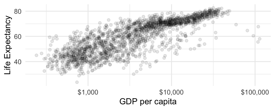
This scatterplot has the following grammar components:
| Grammar Component | Specification |
|---|---|
| data | gapminder |
| aesthetic mapping | x: gdpPercap, y: lifeExp |
| geometric object | points |
| scale | x: log10, y: linear |
| statistical transform | none |
| coordinate system | rectangular |
| facetting | none |
Note that x and y aesthetics are required for scatterplots (or “point” geometric objects). In general, each geometric object has its own required set of aesthetics, which you can find by accessing the geometric object’s documentation (such as by executing ?geom_point)
Example: your first ggplot2 plot
First, load the ggplot2 package by loading the tidyverse with library(tidyverse) (as you can see at the top of this page).
Let’s use the above scatterplot as an example to see how to use the ggplot() function.
First, the ggplot() function takes two arguments:
- data: the data frame containing your plotting data.
- mapping: aesthetic mappings applying to the entire plot. Expecting the output of the aes() function.
Notice that the aes() function has x and y as its first two arguments, so we don’t need to explicitly name these aesthetics.
ggplot(gapminder, aes(gdpPercap, lifeExp))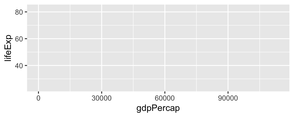
This just initializes the plot. You’ll notice that the aesthetic mappings are already in place. Now, we need to add components by adding layers, literally using the + sign. These layers are functions that have further specifications.
For our next layer, let’s add a geometric object to the plot, which have the syntax geom_SOMETHING(). There’s a bit of overplotting, so we can specify some alpha transparency using the alpha argument (you can interpret alpha as neeing 1/alpha points overlaid to achieve an opaque point).
ggplot(gapminder, aes(gdpPercap, lifeExp)) +
  geom_point(alpha = 0.1)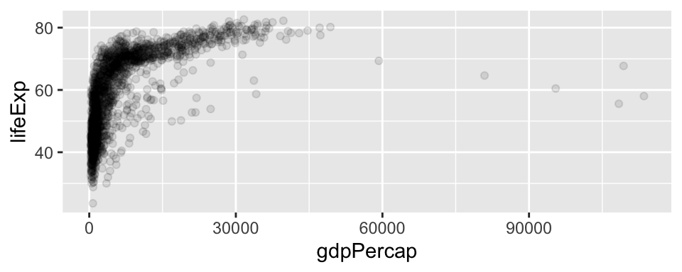
That’s the only geom that we’re wanting to add. Now, let’s specify a scale transformation, because the plot would really benefit if the x-axis is on a log scale. These functions take the form scale_AESTHETIC_TRANSFORM(). As usual, you can tweak this layer, too, using this function’s arguments. In this example, we’re re-naming the x-axis (the first argument), and changing the labels to have a dollar format (a handy function thanks to the scales package).
ggplot(gapminder, aes(gdpPercap, lifeExp)) +
  geom_point(alpha = 0.1) +
  scale_x_log10("GDP per capita", labels = scales::dollar_format())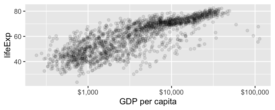
I’m tired of seeing the gray background, so I’ll add a theme() layer. I like theme_minimal(). Then, I’ll re-label the y-axis using the ylab() function. Both of these are not part of the grammar of graphics, but are rather like “decorating” the graph. Et voilà!
ggplot(gapminder, aes(gdpPercap, lifeExp)) +
  geom_point(alpha = 0.1) +
  scale_x_log10("GDP per capita", labels = scales::dollar_format()) +
  theme_minimal() +
  ylab("Life Expectancy")
Test Your Understanding
- True or False: You can re-specify global aesthetics by adding an
aes()layer to a ggplot object. - True or False: With ggplot2, we can specify the data in a geom layer, in addition to the initial
ggplot()layer. - True or False: Because the
dplyr::group_by()function and ggplot2’sgroupaesthetic both split a tibble into groups, we can use either one when making a plot. - True or False: In principle, mapping
continentto letters (a, b, c, …) is an aesthetic mapping.
Your turn: learning to use ggplot2
We think the best way to learn the basics of ggplot2 is to work through Worksheet A3.
First 40 minutes of Class 1
- Haven’t attempted all of the questions on Worksheet A3? Then spend this time attempting unattempted questions.
- Finished attempting all of the questions? Then do the optional R4DS Data Visualization reading, and maybe even do some of the exercises for extra practice.
Put any questions you have about the worksheet questions or about graphing in general in the Google Doc posted to Canvas.
Remaining time in Class 1
Teaching team will go over the questions in the Google Doc.
Class 2: FEV Case Study
We will get a flavour for how you might use ggplot2 in the wild and get in even more practice by working through a continuation of our FEV case study from last week.
By yourself and in small groups, work through the exercises in the case study. We will also discuss instructor answers to each exercise.