Review
We’ll continue exploring the FEV data set from last week. Let’s start by loading the data and required packages.
library(rigr)
library(dplyr)
library(ggplot2)

fev_tbl <- as_tibble(fev) %>% mutate(across(sex:smoke, ~ as.factor(.x)))
Last week, we found that the mean FEV in the smoking group was substantially higher than the average FEV in the non-smoking group. That is, the smokers appear to have better lung function than the non-smokers.
We also had a theory as to why: the association between FEV and smoking status may be confounded, eg. by age/size.
We’ll investigate further this week with our newly acquired plotting skills!
Here are some helpful resources for making plots, now that we are moving towards less “guided” exercises:
Smoking and FEV (unadjusted)
Exercise 1
Now that we have plotting tools, let’s make a plot that compares the FEV of smokers to the FEV of non-smokers.
ggplot(fev_tbl, aes(x=smoke,y=fev, fill=smoke)) +
  geom_boxplot(outlier.shape=NA, width=0.4) +
  geom_jitter(width=0.1, size=0.15, alpha=0.5)+
  scale_fill_manual(values=c("cornflowerblue","darkorange")) +
  ggtitle("Box plots of FEV, stratified by smoking status") +
  ylab("FEV (l/s)") +
  xlab("Smoking Status") +
  theme_bw()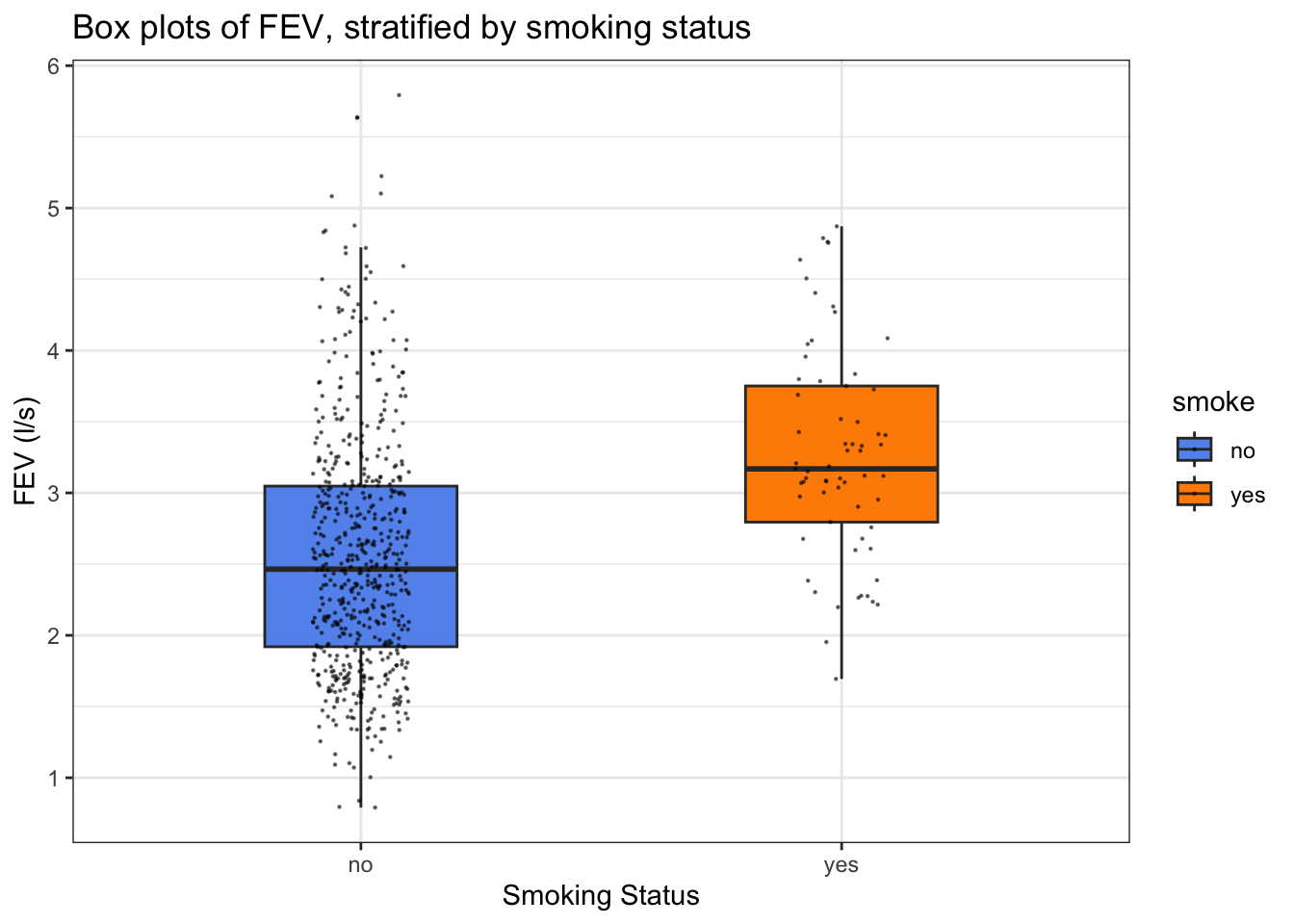
This broadly tells the same story as the summaries we calculated last week, but conveys more information and is more visually engaging.
Informating gathering: what might we want to adjust for?
Let’s do some digging to see if there are other variables that we would like to adjust for, when comparing the FEV of smokers to non-smokers.
Exercise 2
Last week, we found that the youngest patient who smokes is 9, suggesting that there is a difference in the age distribution among smokers and non-smokers. Make a plot that compares these two distributions.
ggplot(fev_tbl, aes(fill=smoke)) +
  geom_bar(aes(x = age, y = after_stat(prop))) +
  facet_wrap(~smoke) +
  scale_fill_manual(values=c("cornflowerblue","orange")) +
  ggtitle("Histograms of age, stratified by smoking status") +
  xlab("Age") +
  ylab("Proportion") +
  theme_bw()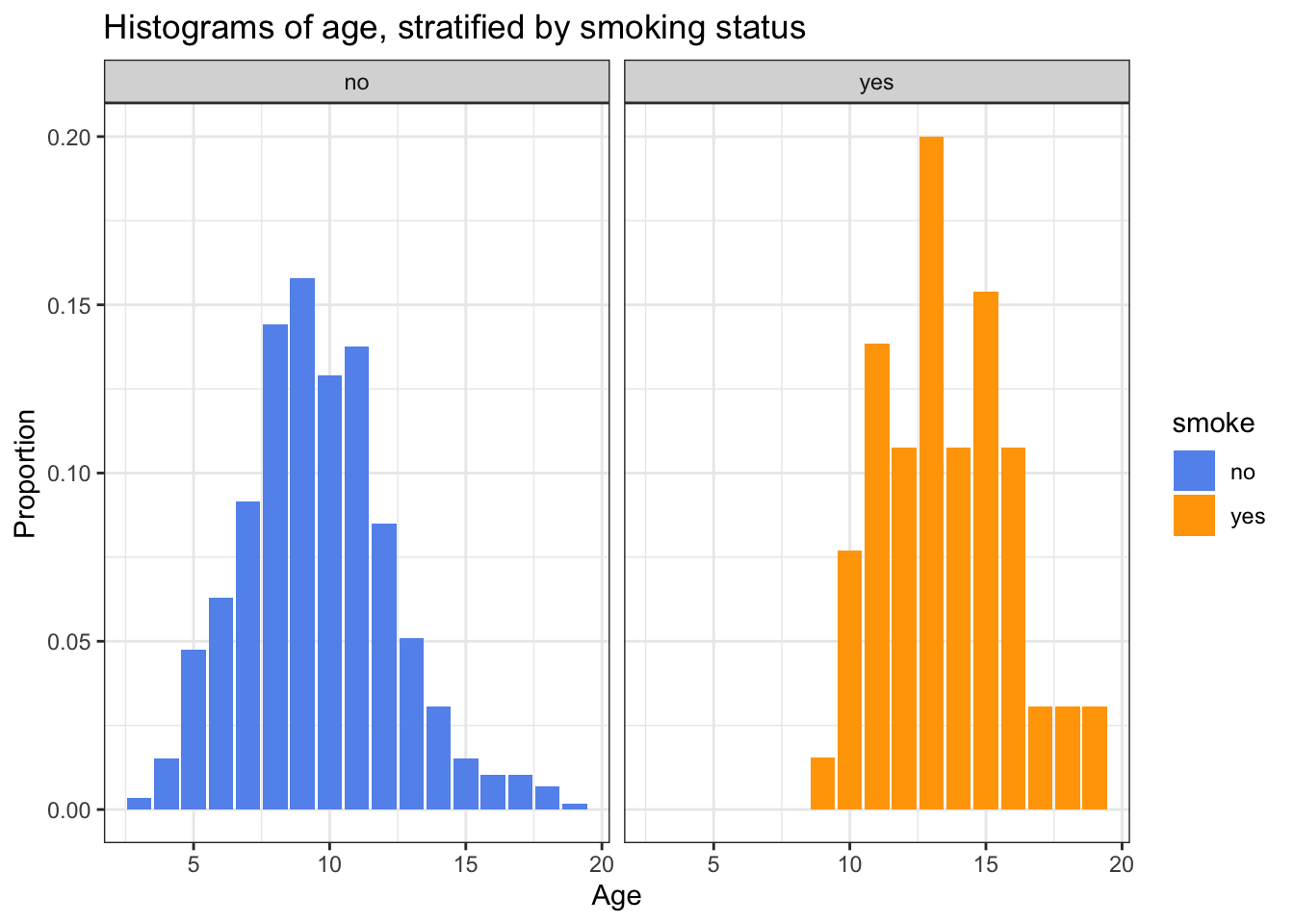
Again, we see that the smokers are overall older than the non-smokers.
Exercise 3
We think that age should be related to height, which in turn should be related to FEV. Let’s investigate that more systematically now with plotting.
How would you like to investigate that with plotting? Here’s one suggestion, though you don’t have to take it: make a plot with two panels, one that has a scatterplot of height versus age for the female patients, and one that has a scatterplot of height versus age for the male patients.
ggplot(fev_tbl, aes(x = age, y = height, colour=sex)) +
  geom_jitter(width=0.2, alpha = 0.75) +
  scale_colour_manual(values=c("cornflowerblue","darkorange")) +
  facet_wrap(~sex) +
  ggtitle("Height versus age, stratified by sex") +
  xlab("Age") +
  ylab("Height (inches)") +
  theme_bw()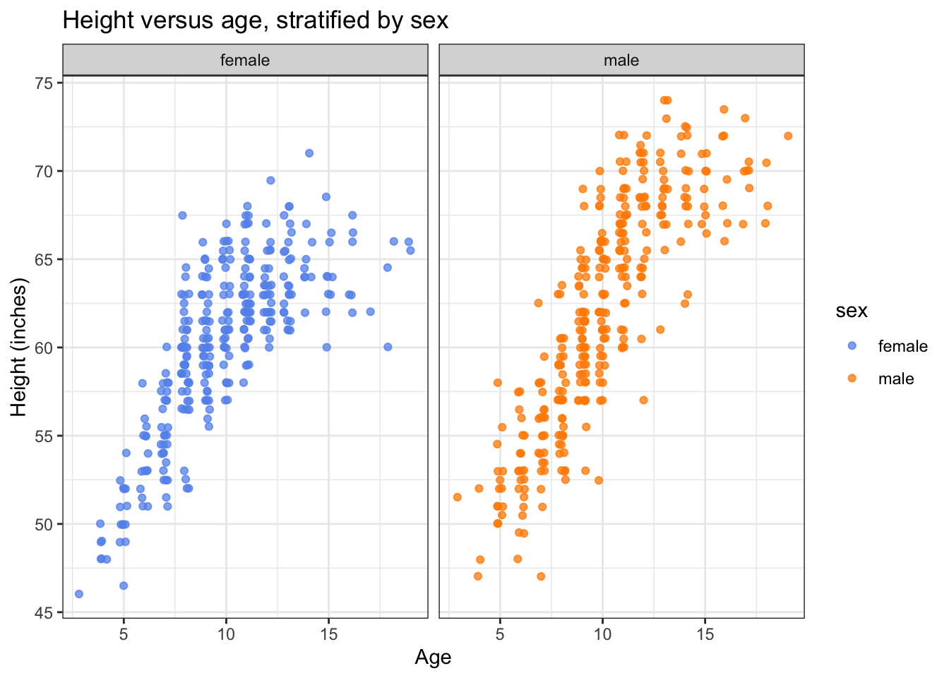
We see that the within-sex trend is similar: height is linear-ish at younger ages, and flat-ish at older ages. Boys wind up taller at older ages.
We will then make a scatterplot of FEV versus height.
ggplot(fev_tbl, aes(x = height, y = fev)) +
  geom_jitter(width=0.2, alpha = 0.75) +
  ggtitle("FEV versus height") +
  ylab("FEV (l/s)") +
  xlab("Height (inches)") +
  theme_bw()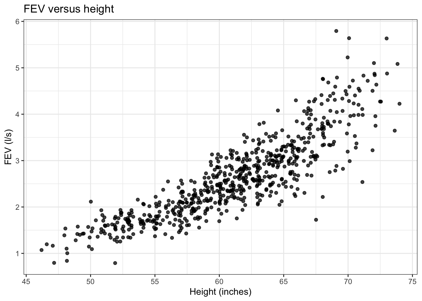
We see that taller participants generally have higher FEV.
Smoking and FEV, adjusted for height
Now that we know that the smokers are older and bigger and have higher FEV, let’s look at the relationship between FEV and smoking status adjusted for height.
Exercise 4
Make a scatterplot of FEV versus height, with points marked by smoking status.
ggplot(fev_tbl, aes(x = height, y = fev, colour=smoke)) +
  geom_jitter(width=0.2, alpha = 0.75) +
  scale_colour_manual(values=c("cornflowerblue","darkorange")) +
  ggtitle("FEV versus height, stratified by smoking status") +
  ylab("FEV (l/s)") +
  xlab("Height (inches)") +
  theme_bw()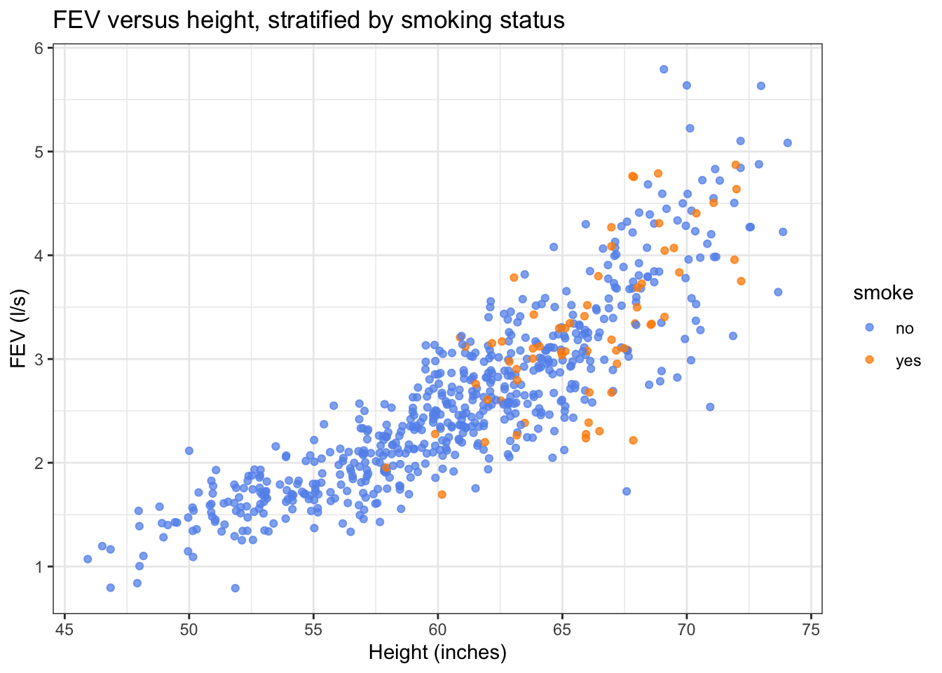
Based on this plot, it seems like the FEV of smokers and non-smokers of the same height is pretty similar.